minimal kustom
smartphones have become ubiquitous, penetrating the lives of everyone within the reach of cell towers. At least, eventually as i am probably one of the last hold outs to finally catch up with this century. i did not even own a lowly brick or flip phone for communication.
Covid changed all that, it becoming necessary to be reachable by cell for admittance to what were previously waiting rooms for various services.
i was not completely unfamiliar with smartphone technology. i used my daughter’s passed-down smartphone while traveling for tethering my laptop. Yes, it could have served in its place but.. Linux :) It did not even have a SIM.
So, with my shiny new Covid upgrade, it wasn’t long before i began exploring Android and how to make the device’s UI fit my workflow.
kustom
third party android launchers were the easiest entry into UI customizations beyond the scrolling display of application icons that typically fill the home screen. The immensely popular Nova Launcher was what i settled on.
After iterations of tweaking i was down to a single digital clock widget and a single row of line drawn icons for my most commonly accessed applications and services. Gestures and a set of application folders on a second screen rounded out this easily configured setup. The home screen was my definition of minimal—all black with minimal content and display, text and line graphics.
This setup was “okay” to the extent i was able to utilize the feature set of the launcher itself. Being ever the tinkerer, several months later, i acquired Kustom’s KWGT widget building app and merrily built my first clock/date oriented application whose display content regions also launched related applications.
Adding (blank) widgets to create other trigger zones further extended the scope of the home screen whilst maintaining the uncluttered display.
Then i heard about Kustom’s KLWP live wallpaper maker on subreddits. While i didn’t envision the need for animation capabilities (at the time)—still the minimalist—the thought of a more seamlessly integrated full screen configuration versus disparate widgets seemed like the obvious framework for my purposes in terms of development and backup recovery.
A quick note to Kustom’s offices to transfer my KWGT licence to KLWP was responded to promptly with great generosity and a request to share my KLWP creations. And so, to return in kind..
monochrome
minimal is probably an overused term when it comes to Android home screens. i’m not sure what it precisely means either. Some feel minimal, others don’t (to me)—but obviously to their authors, that “felt” sense must persist.
Monochrome is a first attempt at a minimal home screen, though, minimalism was not a goal. Rather, as a person whose day revolves around daily hikes, i use my phone for date and time, location and weather—or three zones of information..
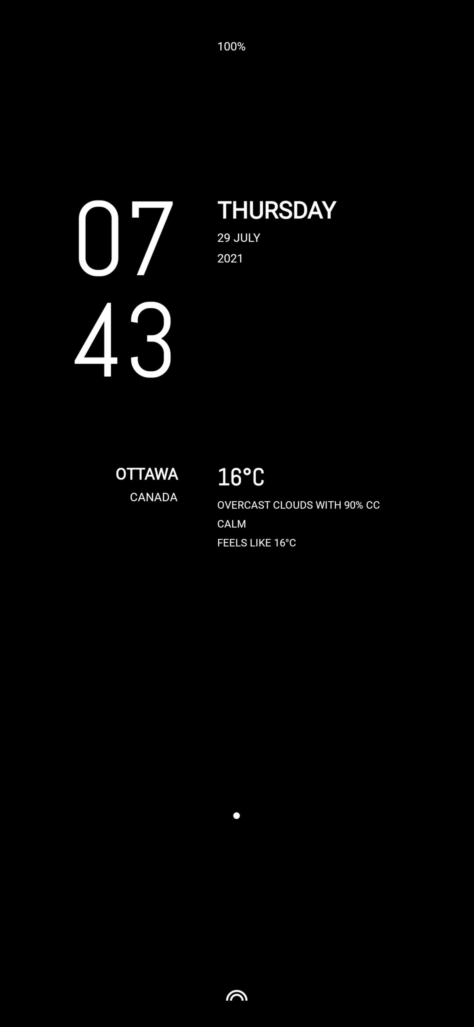
The touch zones cycle via KLWP switches additional display content and launch related applications..
| zone | toggle information | launch application |
|---|---|---|
| below battery % | camera | |
| hour | clock | |
| minute | seconds | |
| day | tasks | |
| date | current / next calendar event** | |
| below calendar event | calendar | |
| city | map | |
| country | gps coordinates gps altitude |
|
| below gps info | compass | |
| temperature | weather | |
| weather conditions | 3 hour forecast 6, 12, 24, 48 hour forecast |
|
| if notification | notifications | |
| dot | invert colorscheme*** | |
| semicircles | menu icons*** |
**Current calendar event will always display regardless of its
switch setting (and can be toggled off after display)
***Animations. See below.
As the above table illustrates, these touch zones provide ready access to several applications without the need for separate application icons. Whether all these trigger zones still constitute minimalism is up for debate.
Monochrome with all information elements toggled on..
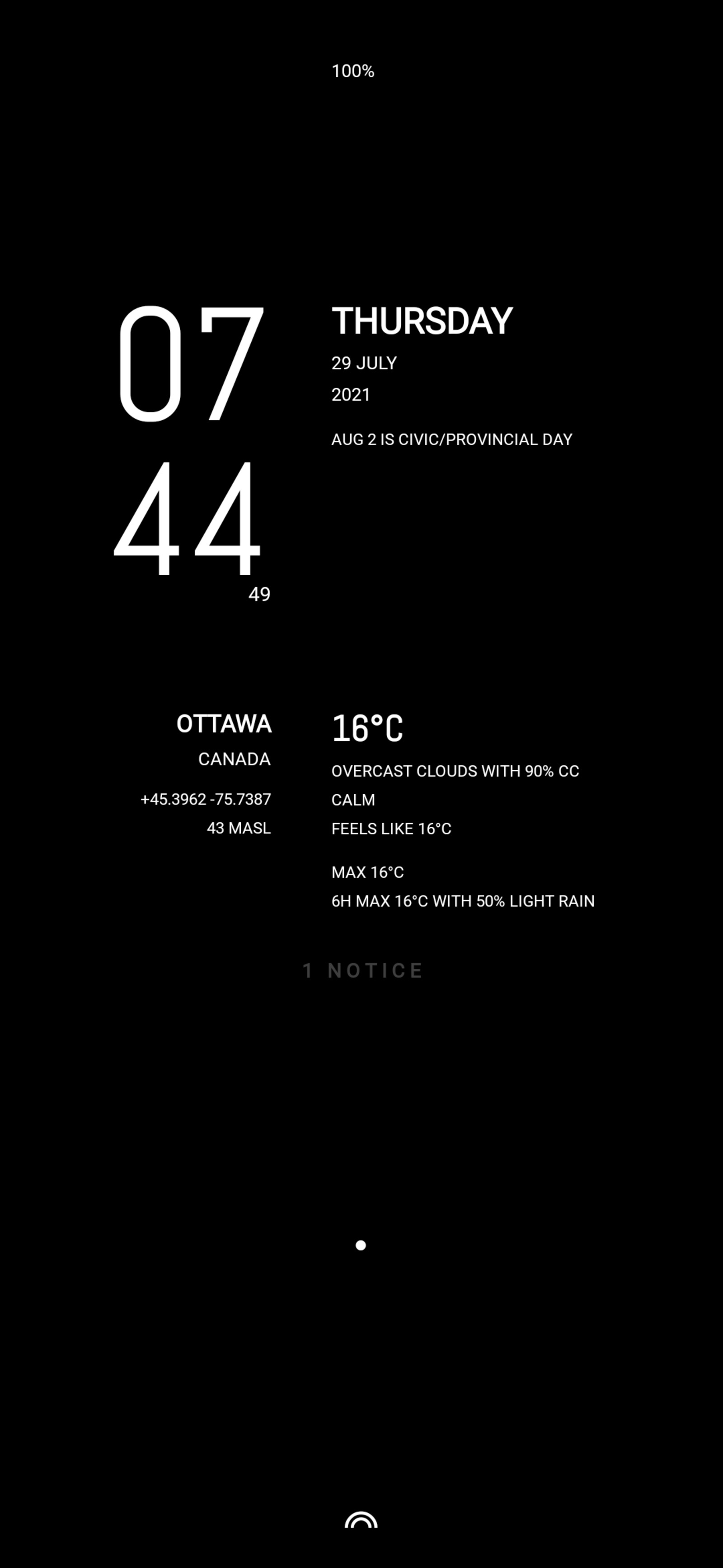
In practice, i usually enable seconds, gps coordinates and the 3 hour forecast—the day’s current calendar event will always automatically display.
This digital clock home screen satisfied me for several months (constantly cleaning and refining its “code” in the KLWP builder while pixel tweaking the layout) until the itch for..
monologue
an analogue variant of monochrome, discards the digital clock face for simple bars and an animated seconds dot—in a complementary colour to accent to the monochromatic theme. With my usual toggled switch settings..
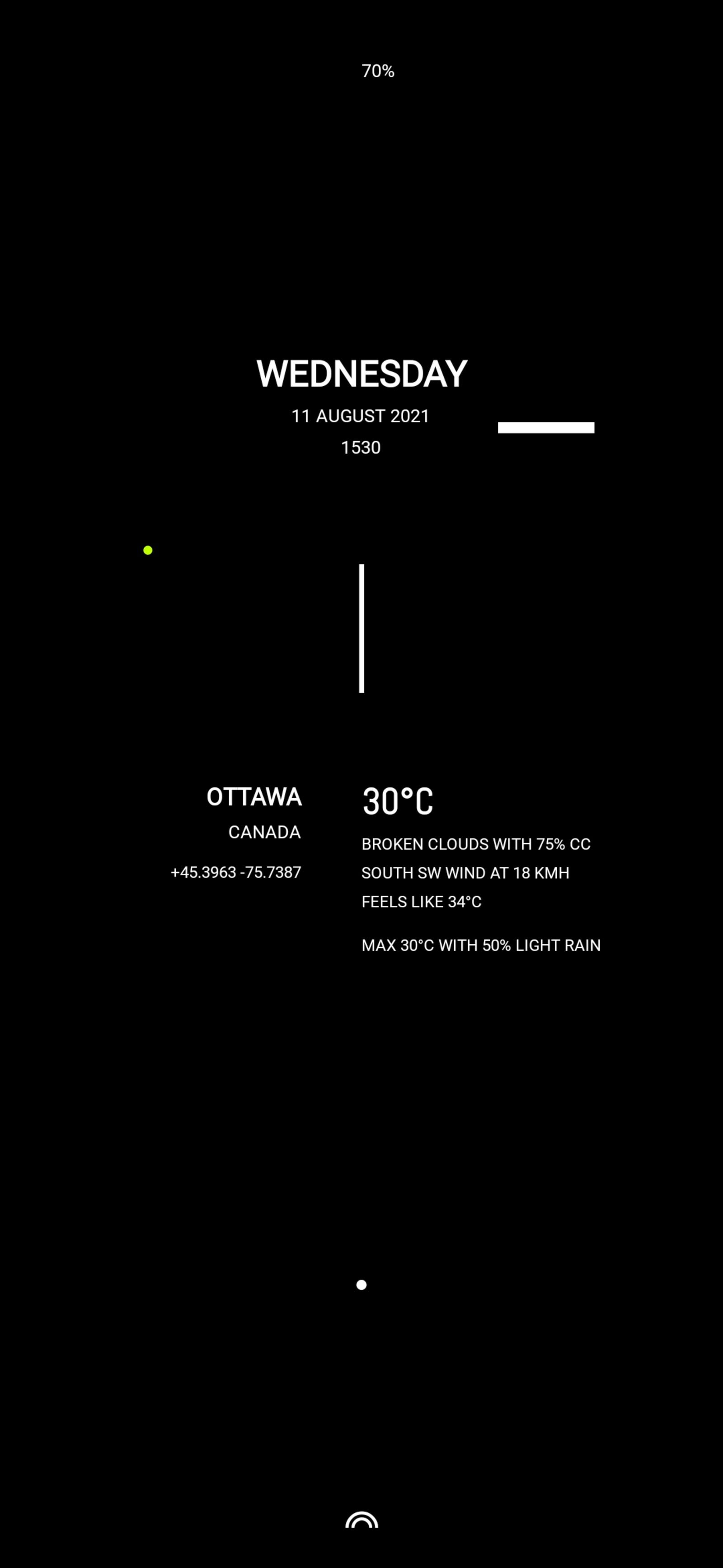
With a sparse stylized analogue watch face, the only difference operationally is the second hand pointer is always shown and the clock application is launched by tapping the zone below the current/next calendar event (not toggled on, below the date). Otherwise, all zones operate identically as with monochrome.
animations
a picture in this case is not quite a thousand words, as the snapshots do not illustrate the expanding white dot (on a black background or contracting white background on toggling the black dot) to invert the colorscheme of the home page..
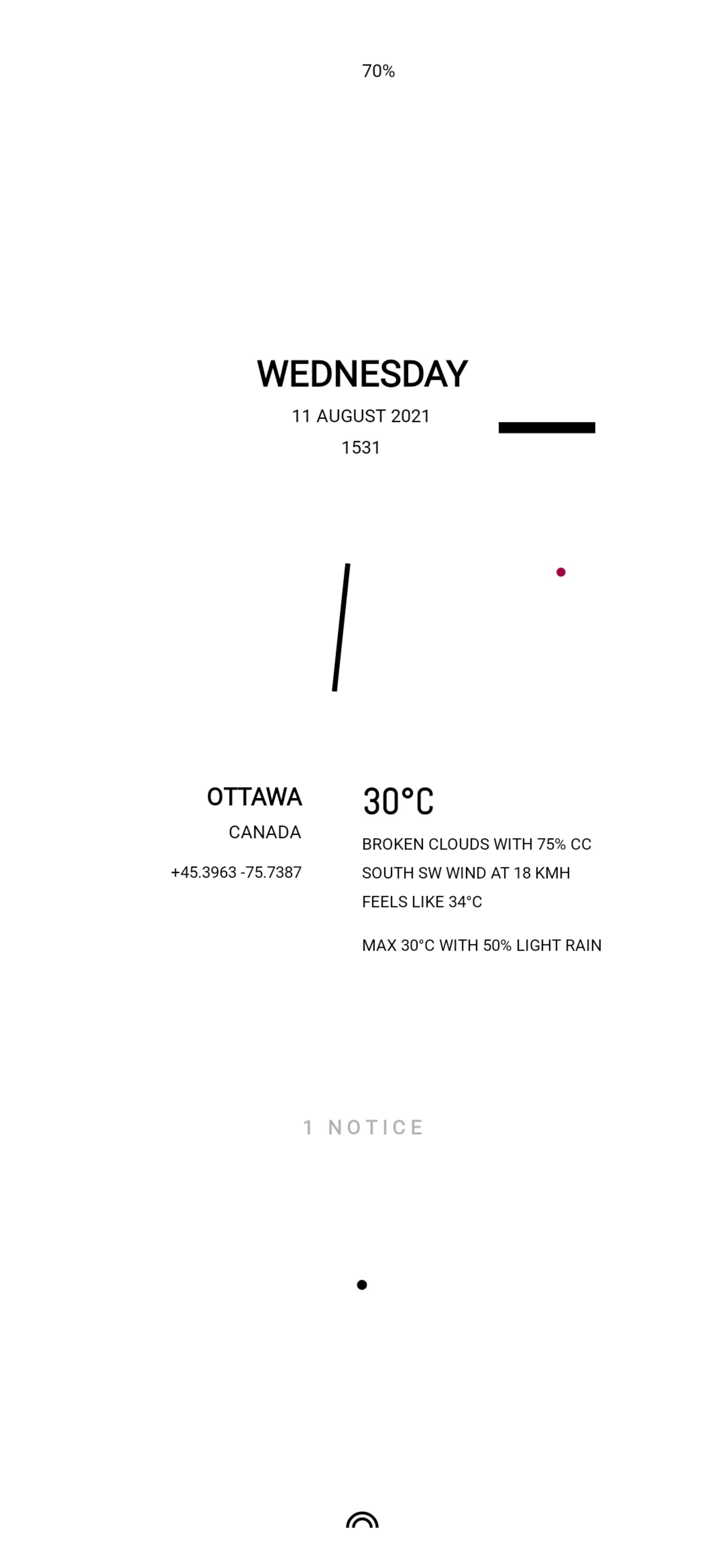
nor the upward sliding inverted colour semicircle and its menu icon applications..
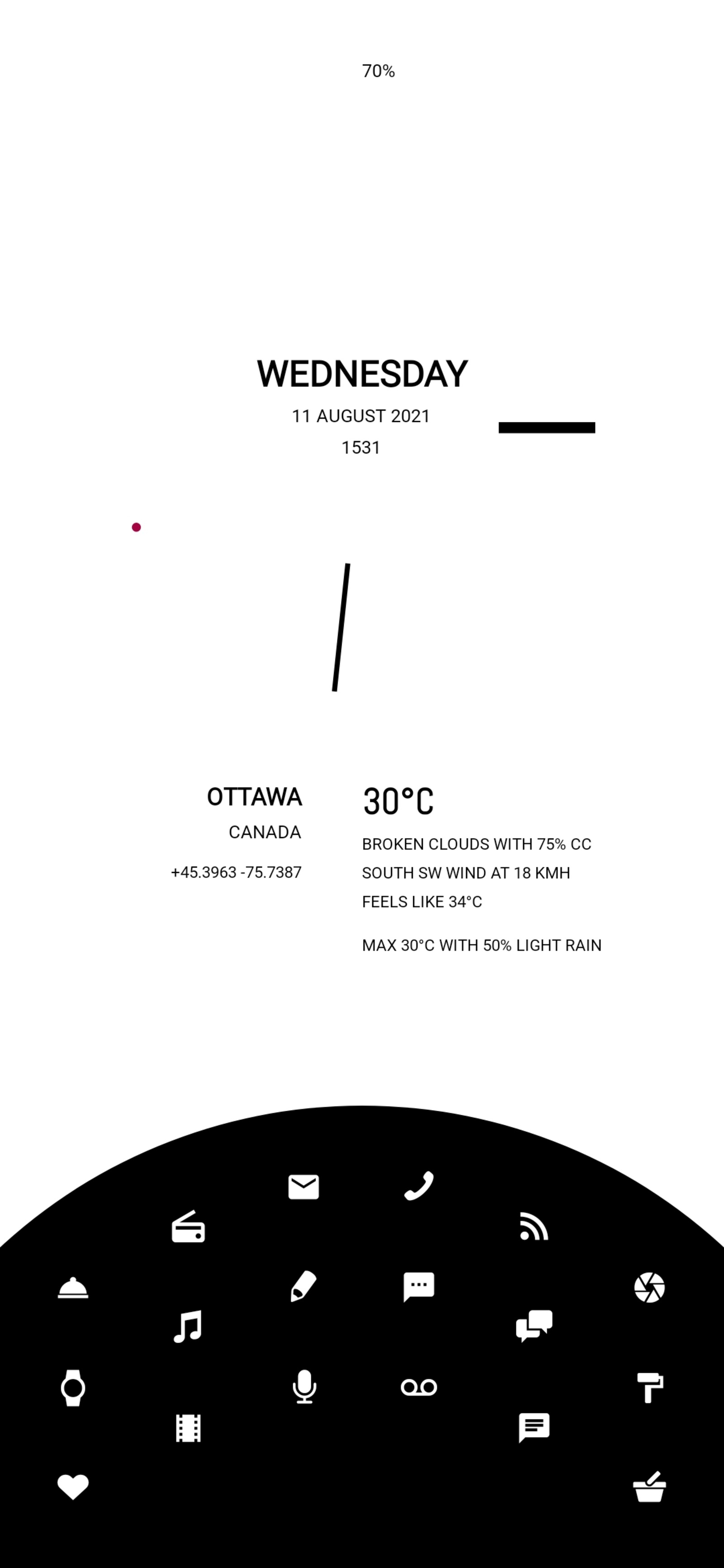
Using KLWP’s available text based icon packs easily facilitates the switchable colour inversion of the display (and menus). Note the tasteful contrasting seconds dot :)
Note: the black status bar at the top is dependent on Android’s default background setting which, in this case, is set to black (my default background for AMOLED power savings). Alas, immersive mode to hide the status bar region does not appear possible on my particular device to my knowledge (short of rooting) :(
resources
klwp is an immensely powerful graphical live wallpaper builder. As such, many things a novitiate might wish to implement may not be apparent. i relied heavily on web resources (and poking around available KLWP wallpapers) to quickly become familiar with KLWP’s features and adopt best practices for using the tool, notably..
Once the basics of KLWP are grasped, endless iterative content and pixel tweaking are easily tested out. A quite enjoyable process actually, to fashion a UI that addresses one’s own particular workflow and information needs.
finishing touches
completing the live wallpaper are a few applications / settings..
| application | configuration |
|---|---|
| Settings | gestures on |
| Nova Launcher | swipe gesture actions |
| Sesame Universal Search | nova integration for search |
| adb shell | hide gesture “pill” |
| gesturePlus | long press “screen lock” |
| Takan Launcher | (on Nova swipe gesture) |
Sesame Universal Search integration with Nova Launcher eliminates the need for a search bar, as well as, shortcut access to applications.
adb shell is a one time configuration set from a computer to attached Android phone..
adb shell wm overscan 0,0,0,-<integer> # hide pill
adb shell wm overscan 0,0,0,0 # restore pill
Takan launcher attached to a Nova swipe gesture may seem odd but its minimalist text (keyboard) overlay presents a clean (highly configurable one column) list of all applications by first letter—useful for hunting down those seldom used and difficult to remember application names—without the visual clutter of the more traditional array of scrolling application icons.
‧ ‧ • ‧ ‧
i’m pretty pleased with the results thus far. It remains to be seen whether my workflow will change sufficiently to warrant a new approach to my home screen (no doubt, someone on the web will provide the inspiration and a way of seeing a solution differently).
Whether this qualifies as “minimal” or not is up for debate, not being the arbiter of such things. i like to think of it, at least, as being “elegant”. Black tie and all :)
analogue
adds a dynamic flare to monologue by substituting an angled seconds pointer—the outer edge of the inward facing pointer tracing its circumference—and an outer ring minute sweep, along with subtle colour highlight animations for an even more open look..
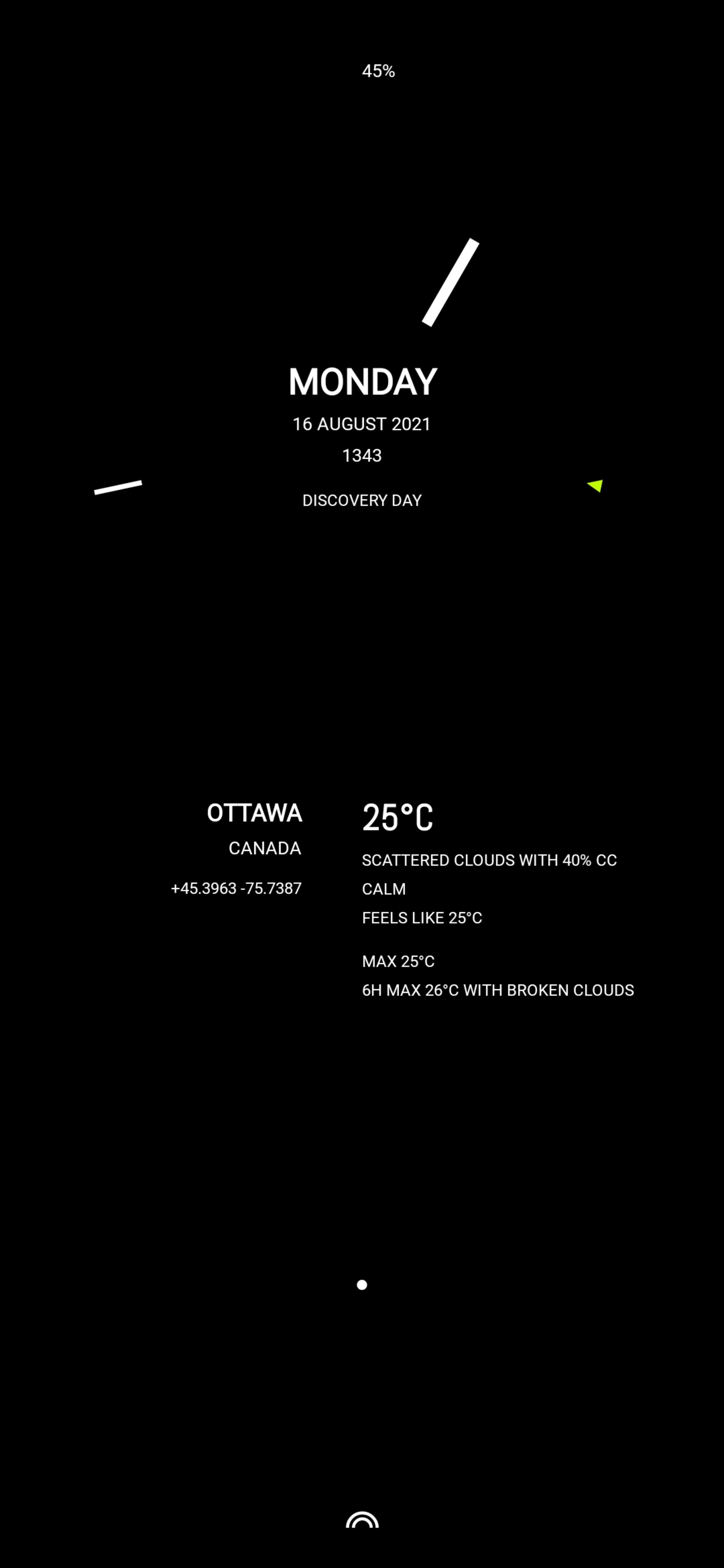
As with the other static images, the effect of these simple shape changes is lost. In motion, it imparts a dynamic focus to the analogue clock face, creating a circular illusion as it traces the time. This accentuates the geometric form of the upper half of the wallpaper against the rounded objects of the lower half creating a balanced but visual tension.
‧ ‧ • ‧ ‧
As can be seen from the above, wallpapers under KLWP are quite malleable with very fine control down to the pixel level. Wholesale changes can be easily tested out, discarded or refined. The tool encourages such.
Given all the wallpaper tweaks i have made along the way i don’t expect analogue to be my last KLWP configuration on the road to my wallpaper endgame, if such a thing even exists..
files
sundial further refines analogue by flashing the minute hand on the “fives” and the hour hand on the hour with the second pointer color. Pixel tweaks add a touch of separation between the minute and hour hands—when aligned, the hour hand is coloured for that minute.
Almost done..